What Is "Above the Fold," and Does It Still Matter?
4 min read · November 2, 2026
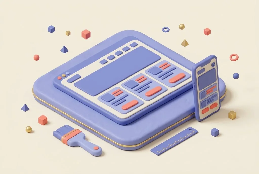
The phrase comes from newspapers. Papers were sold folded, so the top half of the front page was what buyers saw first. On a website, above the fold means whatever shows on the screen before a visitor scrolls.
Is there still a fold?
Not a single one. Screens vary a lot: a tall phone, a wide laptop, a large monitor. What shows without scrolling is different on each, so there is no magic line to design around. But the idea behind it still holds. Visitors decide within seconds whether a page is for them, and they decide based on what they see first.
As a rough guide, picture the first screen on a typical phone. If a visitor sees only an image and a menu icon, nothing has told them what you do yet.
People do scroll
A common worry is that visitors never scroll. They do, as long as the top of the page gives them a reason to. Cramming everything into the first screen is not the answer. A clear start and an inviting next section work better.
What should be visible first
- What you do and who it is for, in plain words
- Where you work, if you serve a local area
- One clear next step, such as Call or Get a Quote. See what makes a good call-to-action button
- A trust signal, such as a rating, years in business or a recognizable name
- A clear menu, so people can find their own way
Your headline carries most of this. See how to write a homepage headline that works.
What to keep out of the way
- A huge image with no words on it
- A rotating banner. See whether image carousels are worth having
- Pop-ups and notices that cover the page the moment it loads, including cookie banners that take over the whole screen
- A slow video that leaves an empty space while it loads
It also helps to look at the page without your own knowledge of the business. You know what you sell, so it is easy to assume the page makes that clear. A fresh pair of eyes will tell you whether it does.
How to check yours
Open your site on your own phone and on a laptop, without scrolling. Then ask a friend to look at it for five seconds and tell you what the business does. If they cannot, the top of the page needs work. A slight peek of the next section at the bottom of the screen also tells people there is more to see.
Since so many visitors arrive on phones, start there. See what mobile-friendly actually means.
Revisit it whenever you change the homepage. A new banner or announcement can quietly push the important details below the screen.
See it in action
SwiftFlow Plumbing
A mobile-first plumbing site built to turn visitors into booked jobs.
You might also like
Want a homepage that makes the right first impression?
Durays Dev builds fast, clean, conversion-focused websites for growing businesses, with a free concept before you commit.
Get a free concept